Portfolio

Graphic Design

Branding Suite

Date: February 2022

Role: Designer

For my personal branding, I created a logo based on my initials and decided to use blue tones to signify strength and trust. 

As an experienced graphic designer, I hope to convey trust towards future clients or employers.  

T-shirt and Hat Mockup

Date: April 2022
Client: Minnesota National Guard
Role: Designer

The T-shirt and Hat designs originally began as a project for a hat for the Minnesota State Fair's Veteran's Day 2022. 

I used Adobe Illustrator to create a vector of each design.

I created a silhouette of a service member saluting and placed a white star, representing the 'North Star State', in the center. 

I then used photoshop to create a mockup of the design. 

The Minnesota and USA flag was one of the original four designs I came up with for the hat. I adapted it to fit on the back of a t-shirt because I the feedback I received from colleagues and peers showed that it was a much better design for a shirt than a hat. 

This design is currently still in the beginning phases but will be completed in the coming months in preparation for the state fair in August. 

Minnesota National Guard Inforgraphic

Date: February 2022
Client: Minnesota National Guard
Role: Designer

I was asked to create a visual for the nearly 13,000 Airmen and Soldiers who serve the state. The goal of the project is to inform the target audience of the Adjutant General’s pillars and priorities in a visual manner.

I began researching examples of successful infographics. I took pen to paper to sketch out several concepts. Next, I began developing the icons in Adobe Illustrator.

The Adjutant General selected the design he wanted from the four mockups I provided. I added the words Minnesota National Guard Campaign Plan Operation North Star to the top to align with the Adjutant General’s vision.

The infographic features hierarchy in both typography and layout. The colors were selected from the State’s style guide and the fonts were selected based on this years annual report.

From the beginning to the end, I was able to explore various ideas and concepts. The final design showcases design principals such as line, repetition, balance, white space, pattern, and movement. In this process, I involved several people for critiques. The final version was made into an 8.5x11 version and an 11x17 version and exported to a PDF in CMYK color to ensure that both posters and handouts could be printed effectively. 

VISITOR'S GUIDE BROCHURE

The Camp Ripley Visitor’s Guide Brochure project was a remake of an older version for a more modern look. For this project, I wanted to test my technical ability by creating connecting shapes between the panels. This was difficult to ensure that everything lined up perfectly along the folds, but it created an inviting design overall.

This project was created using some photographs I took as well as copyright free images I found online. For my photos, I performed basic photo editing using Adobe Bridge’s Camera Raw feature. I used Adobe InDesign and created grids to align everything.

I maintained a lot of the information from the previous brochure; only updating the layout and photos. I also wanted to focus on hierarchy of text and ensure that the eye can travel throughout the piece with ease.

I chose to use an orange-toned background for many elements to grab the attention of potential readers. The color also played well with the deep blue tones in a lot of the images I selected because of the contrast.

In the inside of the brochure, I focused on the history, facilities and attractions of the base because we are marketing to not only those here for training but also those who visit the campground. Placing these elements on the inside, allows Camp Ripley to market themselves while also providing information on the immediate area.

DATE:

NOVEMBER 2021

CLIENT:

CAMP RIPLEY

ROLE:

DESIGNER

Click photo for more

Welcome sign campaign

Date: September 2021
Client: Camp Ripley
Role: Designer

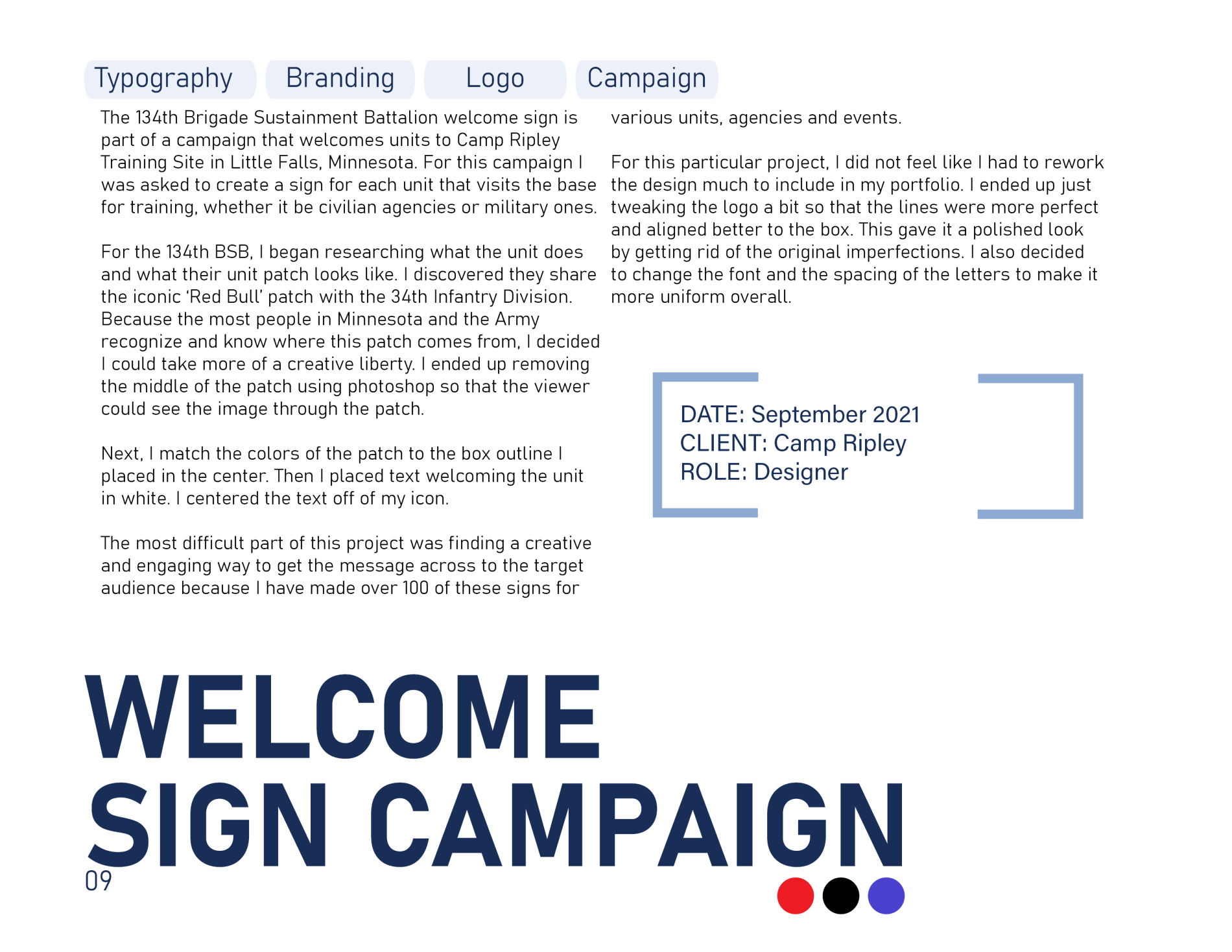
The 134th Brigade Sustainment Battalion welcome sign is part of a campaign that welcomes units to Camp Ripley Training Site in Little Falls, Minnesota. For this campaign I was asked to create a sign for each unit that visits the base for training, whether it be civilian agencies or military ones.

For the 134th BSB, I began researching what the unit does and what their unit patch looks like. I discovered they share the iconic ‘Red Bull’ patch with the 34th Infantry Division. Because the most people in Minnesota and the Army recognize and know where this patch comes from, I decided I could take more of a creative liberty. I ended up removing the middle of the patch using photoshop so that the viewer could see the image through the patch.

Next, I match the colors of the patch to the box outline I placed in the center. Then I placed text welcoming the unit in white. I centered the text off of my icon.

The most difficult part of this project was finding a creative and engaging way to get the message across to the target audience because I have made over 100 of these signs for various units, agencies and events.

For this particular project, I did not feel like I had to rework the design much to include in my portfolio. I ended up just tweaking the logo a bit so that the lines were more perfect and aligned better to the box. This gave it a polished look by getting rid of the original imperfections. I also decided to change the font and the spacing of the letters to make it more uniform overall. 

Pasta Amore Website

Date: October 2021
Client: SNHU/PastaAmore
Role: Designer

TalentStack Brand Guide

Date: September 2021
Client: TalentStack
Role: Designer

PASTA AMORE PRODUCTS

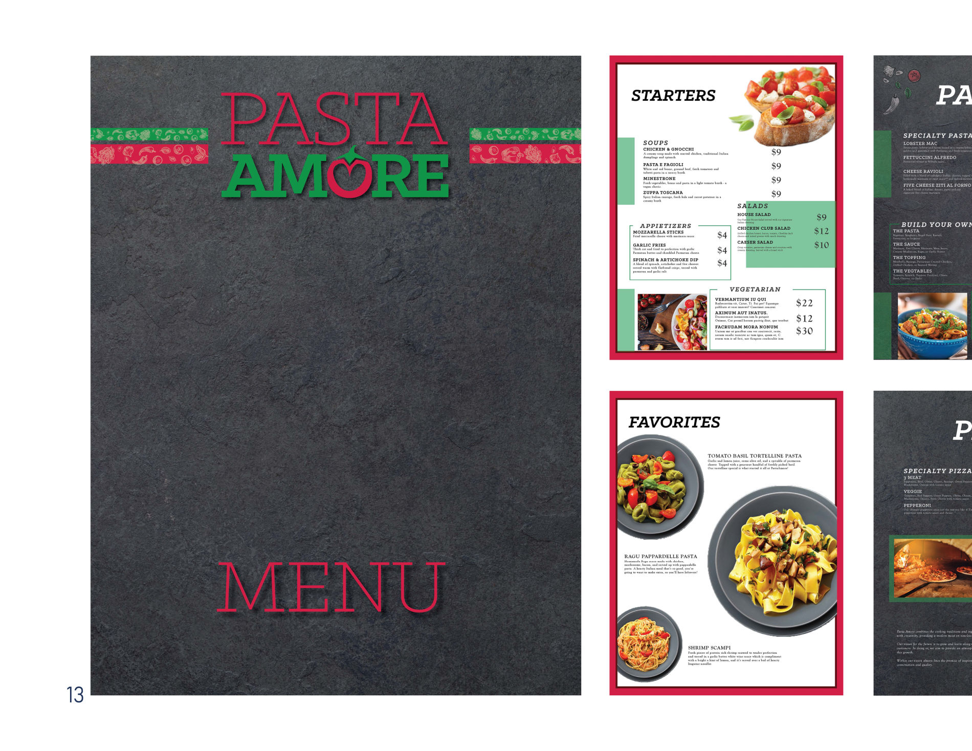
I made the Pasta Amore products for a class I attended at Southern New Hampshire University. The products include a flipbook table tent design, a menu, and a brochure menu. These products were all created in 2021 using InDesign, Illustrator and Photoshop.

I used Illustrator for the icons and borders of various Italian ingredients to match the type of restaurant.
For the table tent, I wanted to incorporate a flipbook design to show clients specials, the Pasta Amore mission and various announcements. The idea behind the flipbook allows the client to add messages and specials periodically while communicating various ideas to the customer.

The first page I created highlights appetizers. This allows a customer to begin thinking about what they want to eat before they even look at the menu. For the flip book I chose to alternate messages between the ingredients border and a simple red border to maintain brand identity. This also gave me the opportunity to create a cohesive design and allowing some creative liberty.

When I began creating the full menu, I wanted to maintain the simple yet friendly atmosphere that the table tent had. On the cover, I chose to use the same ingredient icons in a pattern to create a more interesting visual. I also thought back to when I was a kid; pizza hut used to do something similar. Since Pasta Amore is a family friendly restaurant, I wanted to mimic what I had seen growing up.

For the first page of the brochure, I chose a picture to cover all three panels. During my research page I found a few examples of brochures that did it like that and I liked those ones the best. On the cover panel I chose to keep it simple by including only the logo and what was inside the brochure (the dine in/take out menu). For the back panel, I included a marinara red box with a directional feather to pull the background into the design. I also added a simple graphic of a map of the location of the restaurant as well as the address. For the last panel of this page, I added the mission statement and vision from the brand book. I put these elements into the same style brackets I used on the menu. I also added two stripes of color with the icons as a decoration. Lastly, I put the logo on the bottom third along with social media icons so that customers can follow the restaurant if they want.
For the inside page, I borrowed elements from the menu such as the green 50% opacity boxes. I put two categories on the outside panels and three categories on the middle panel. On the outside panels I used photos to break up the text. On the middle panel, I decided to go with a green rectangle and the same icons on the outside edges. I also made the text on this page the cannoli color. Lastly, I added a thick and a thin border using colors from the style guide.

My brochure features a simplified and easy menu for to-go orders or deliveries for the busy families out there. It also features borrowed elements from both the menu and table tent creating a strong and cohesive look.  

DATE:

AUGUST 2021

CLIENT:

SNHU/PASTA AMORE

ROLE:

DESIGNER

Click photo for more

Lil' Guppies Brand Guide

Date: June 2021
Client: SNHU/Lil Guppies
Role: Designer

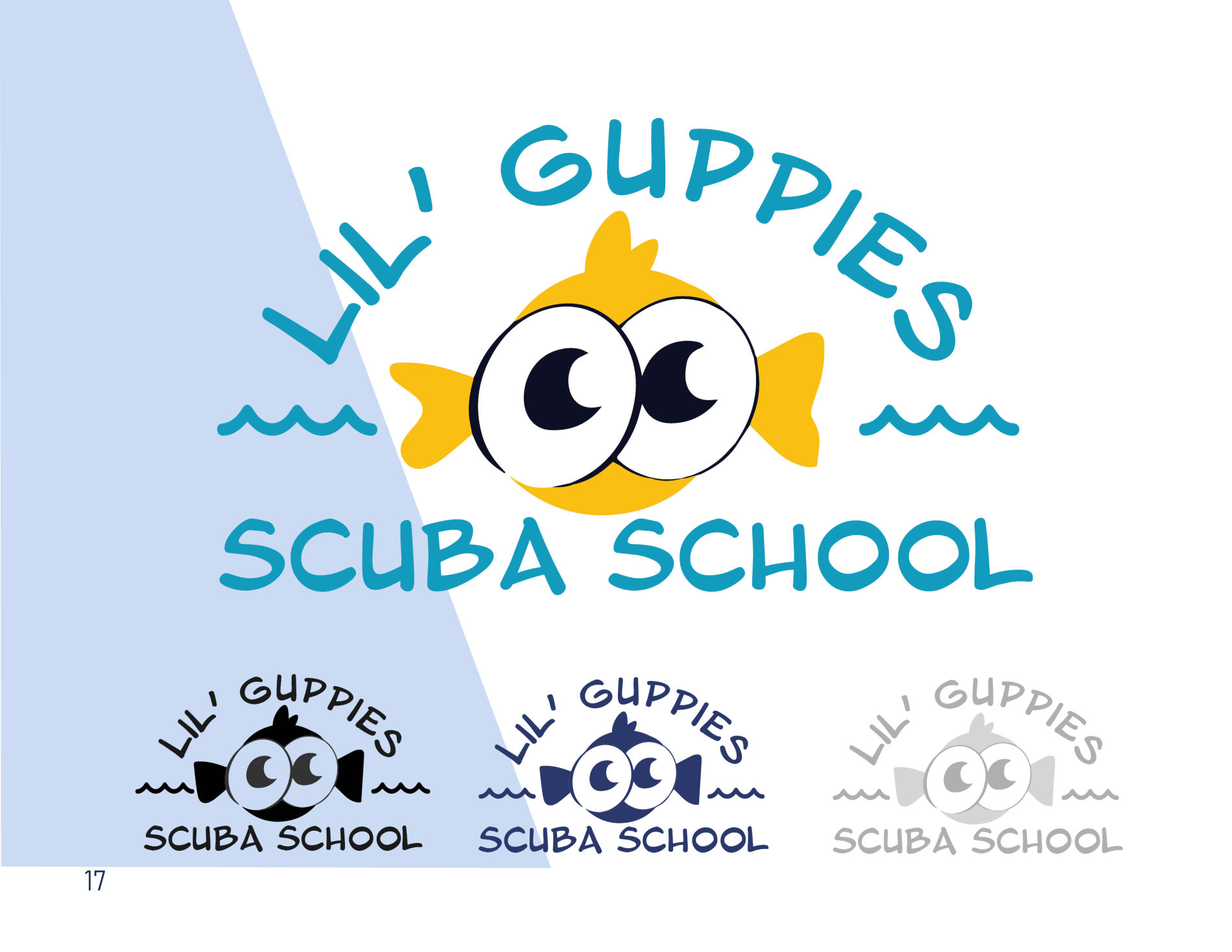
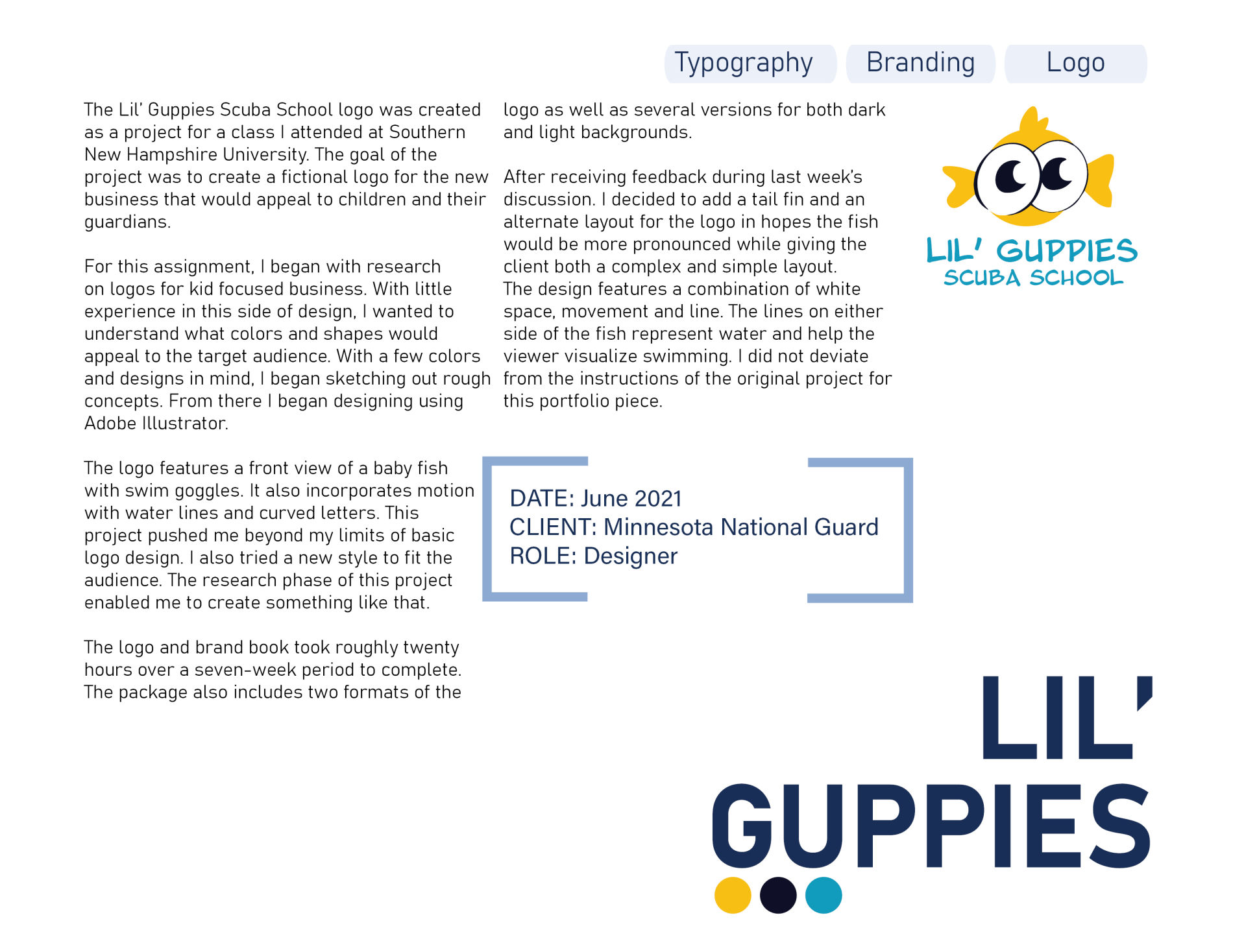
The Lil’ Guppies Scuba School logo was created as a project for a class I attended at Southern New Hampshire University. The goal of the project was to create a fictional logo for the new business that would appeal to children and their guardians.

For this assignment, I began with research on logos for kid focused business. With little experience in this side of design, I wanted to understand what colors and shapes would appeal to the target audience. With a few colors and designs in mind, I began sketching out rough concepts. From there I began designing using Adobe Illustrator.

The logo features a front view of a baby fish with swim goggles. It also incorporates motion with water lines and curved letters. This project pushed me beyond my limits of basic logo design. I also tried a new style to fit the audience. The research phase of this project enabled me to create something like that.

The logo and brand book took roughly twenty hours over a seven-week period to complete. The package also includes two formats of the logo as well as several versions for both dark and light backgrounds.
After receiving feedback during last week’s discussion. I decided to add a tail fin and an alternate layout for the logo in hopes the fish would be more pronounced while giving the client both a complex and simple layout.

The design features a combination of white space, movement and line. The lines on either side of the fish represent water and help the viewer visualize swimming. I did not deviate from the instructions of the original project for this portfolio piece.   

The Persian Mastiff Logo

Date: February 2021
Client: Hamisha Alkamooneh
Role: Designer

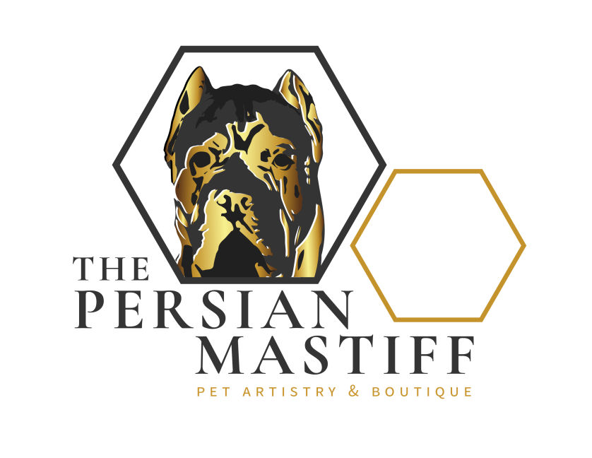
The Persian Mastiff logo was created in December of 2021 for a local St. Paul dog grooming salon. The logo features a detailed illustration of the Persian mastiff dog breed. The client specified that the black and gold colors, dog and hexagons were present in the logo. The client also wanted the logo to appear high end and professional.

Knowing the requirements, I got to work looking at photos of Persian mastiffs and classy logos. This project was one of my first working with an actual client. It gave me an opportunity to try new techniques and present my ideas as well as working closely with another person to achieve the look they desired.

I chose to incorporate a gradient in the dog to mimic the look of gold. I used a combination of white and black lines to highlight wrinkles on his face to better represent the breed. I placed the dog inside on of the hexagons and formatted the words to follow the overall shape. I recognized that this logo may be difficult to resize. This led me to create a word mark as well as an icon.
In both designs, I used emphasis on the words ‘The Persian Mastiff’ because this is the name of the actual business. The words ‘pet artistry & boutique describe what the business does and therefore did not need to be as large as the name.

Additionally, the products included multiple versions for a light background, dark background as well as a black and white version and a reverse black and white version.  

Magazine Cover

Date: February 2021
Client: SNHU
Role: Designer

The Headspace magazine cover was created for a project during a class I attended at SNHU. The project involved making two magazine covers for different audiences using the same image.

I chose a photo of a woman wearing a hat I found using creative commons. After downloading the image, I did some research on various types of magazines and layouts. I decided to create a mental health focused magazine and a fashion one.

In the past, I have created magazines, newsletters and annual reports. Most times I was limited by an already existing template.

For this specific project, I decided to look in local stores to see how popular magazines look. I paid specific attention to the ones that caught my eyes first and mimicked a similar approach.

For the mental health magazine, I changed the image to black and white using Adobe Photoshop and Camera Raw. I also adjusted the curve for a more dramatic look. Next, I created an Adobe InDesign document and placed the new image on top. I decided to include a black background to call attention to specific words.

Next, I added a heading on the top of the page that describes what the magazine is about. I also included a spark symbol between these words to create separation and repetition between them. Next, I focused on how I wanted the eye to move around the page. I used white for the main text and yellow to call attention to specific areas.

This project gave me an opportunity to focus on two specific audiences. It also allowed me to look at a different type of design from what I was used to and really focus on the effect of typography. The use of color also created a fun challenge in making a professional design with a limited palate.

The design was created and exported as a PDF using CMYK color to ensure printer ready.

MNNG ENVIRONMENTAL REVIEW

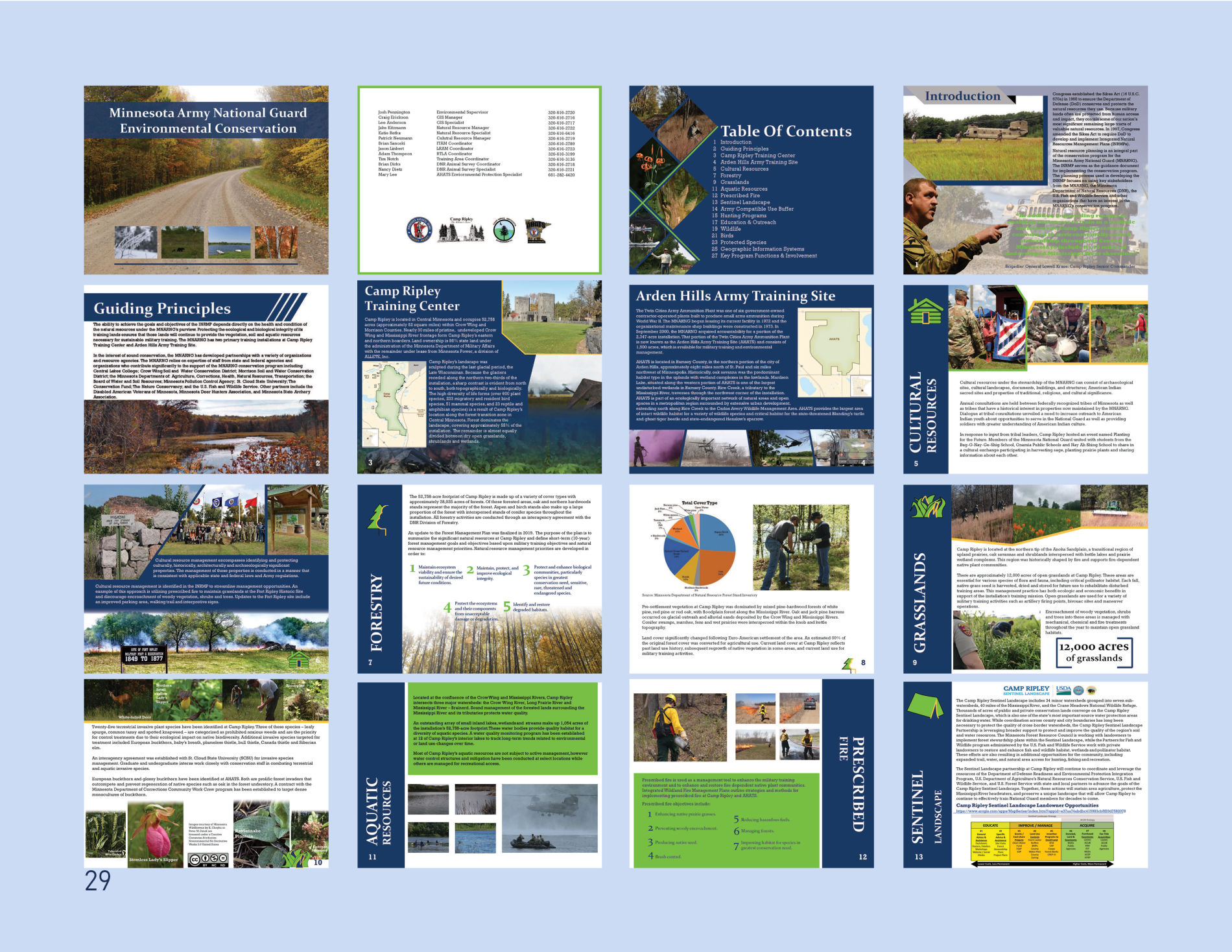
For the Minnesota Army National Guard Environmental Conservation 2019 Annual Review, I was asked to create a visual report for Camp Ripley’s environmental team. I used Adobe InDesign for the report, Photoshop for image editing and Illustrator to create graphic icons for each topic.

In past years, the team had created a 50+ page document of text and data. This project was the first time they wanted to focus on visual elements to tell their story. The overall timeframe for this project was about three months and I was the sole designer.

The photos used throughout were mostly taken by myself or my coworker. The photos not taken by us were credited to the creator.

The color scheme matches the Minnesota state branding guidelines to align with other state programs.
I began this project by studying the previous annual reports and creating individual icons for topics. These icons were placed with the topic heading and then used near the page numbers for each subsequent page. I decided to do this so the reader would know that the topic they were looking at continued on multiple pages.
For some images I used a feather gradient to make more room for text.

I also focused on how the layout would appear when the book is opened. I created flow by changing shapes of images to create a cohesive look. I ensured that the white space was balanced using a grid layout. 

DATE:

DECEMBER 2019

CLIENT:

CAMP RIPLEY

ROLE:

DESIGNER

Click photo for more

Challenge Coins

Date: July 2021
Client: Camp Ripley
Role: Designer

Challenge coins are a tradition across all branches of the military and are presented to service members who exceed expectations consistently. As part of the tradition, unit leadership presents the idea and pays to have to coins made.

For each coin I have made, I worked closely with the leadership to ensure they got exactly what they were looking for. This type of process involves a series of revisions and tweaks. I first learned how to design a challenge coin at the Defense Information School at Fort George G. Meade, Maryland in 2020.

Using these skills, I sketched the concept for each design. For the Training Support Unit, I needed to create digital layouts of various elements that related to Camp Ripley. This included the iconic front gates built by the Works Progress Administration, the iconic water tower and the unit patch.

The back of the coin features a portion of the Great Seal of the United States and matches the colors and design of the unit’s guide on flag.

While creating the 682nd Engineer Battalion coin, I was able to play around with new or odd shapes. I wanted the castle to be stand out from the design because it would be printed on top. I also angled it and used 3-dimensional effect to achieve this look. From there, I traced the outline to create the back of the coin.

The back of the coin mirrors the front and includes all elements specified by the 682nd Command Team. The shape of the coin allows it to stand on its own, making it a unique design.

Overall, this project involved a lot of back and forth between the command teams to achieve the look they desired. Both projects taught me how to create a cohesive design for print on a small surface.

After receiving feedback from other students, I decided to alter the text to a new font and all capital letters to make it stand out more from the design. I did not deviate from the instructions to include in my portfolio.  

Holiday Cards

Date: November 2020
Client: Camp Ripley
Role: Designer

Each year, Camp Ripley’s fulltime staff takes a photo for a holiday card which they send to the public, local and state partners as well as state representatives. I served as the sole designer for both the 2020 and 2021 design.

The 2020 design, I modeled after previous years while also creating a fun layout of the front using red and gold dots to represent celebrating the holiday season. The back side of each card features photos I took of events and training on base.

After creating the 2020 card, I wanted to push the boundaries. I decided to use a simple white wood border with a garland on the front. I place the words ‘Happy Holidays’ in a script font to match the purpose of the card.

On the back, I created a layout featuring photos from the year of differing sizes while also including various colored borders to match the text used. I used a grid layout to create the design. I also started with sharp cornered photos while I made the layout.

Once the layout was perfect, I switched the borders to have rounded corners.
For the back of the card, I used a dark green to represent the Army and match the front of the card.

Overall, this two-year project gave me the chance to demonstrate my basic abilities and then to grow that into a more creative and cohesive design.


View More Projects

Photography
Videography
Journalism

© Copyright Mass Alk Design 2022.